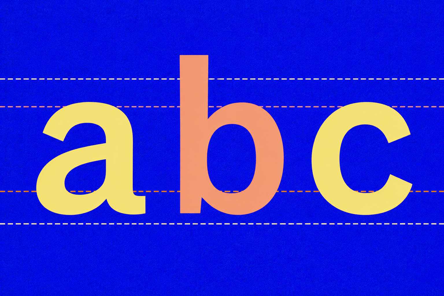
lowercase is a vibe. Uppercase are communication.
Context switches matter more than aesthetics.
gen z turned off autocaps and called it a personality.
The Guardian put it well: lowercase reads as a "calm, friendly" tone, a way to reject the "authority and rigidity" of traditional grammar.
and honestly? it's not just the shift key.
when every sentence starts lowercase, text stops feeling like it has a beginning or an end, like one long breath with no edges. same when you end a sentence with a period and start the next one lowercase. the boundary disappears. that's why it feels cramped, not aesthetic.
Looks like a messy kid's room.
but "ok will do" to your client reads as lazy. not chill. this is how business works.
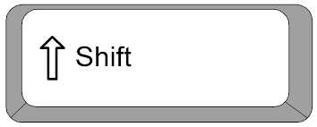
the shift key isn't a power structure. it's a context switch. so is the period. so is starting the next sentence with a capital.
bell hooks lowercased her name to shift attention from herself to her ideas. a political act.
gen z lowercased everything to feel less formal. a cultural act.
both are valid. until you're misunderstood. (yes, you will.)
in text-based channels (after pandemic) tone lives in punctuation and casing. sarcasm, warmth, irony, they don't travel well without them. business runs on text.
that's where misreads cost you.
example vocab:
| you send | you mean | gen z hears |
|---|---|---|
| OK. | everything is okay | am I getting fired? |
| ok | yes, got it | sarcasm |
| ok. | casual agreement | am I in trouble? |
| Sure 👍🏻 | I agree | sarcasm |
| Please do 😂 | sarcasm | lol I'll do it |
language evolves.
know your audience. use the shift key. the period is good.
lowercase is a vibe. Uppercase letters are communication.